


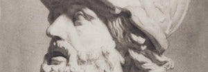


- Faun and Nymphe Poster
- The Dream Poster
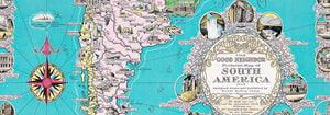
- Visit Puerto Rico Poster
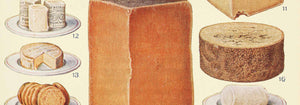
- Butter Poster
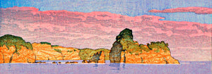
- Ecchu Umidani Pass Poster
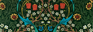
- The green tree library Poster
- Atlas of the Munsell color system Poster
- Adelaster Albivenis Poster
- Flower Market - Mumbai Poster
- Flower Market - Kyoto Poster
- Flower Market - Dehli Poster
- Flower Market - Cape Town Poster
- Flower Market - Cardiff Poster
- Flower Market - Seoul 2 Poster
- Flower Market - Sao Paulo Poster
- Flower Market - Rome Poster
- Flower Market - Milano Poster
- Flower Market - Berlin Poster
- Flower Market - Amsterdam Poster
- Flower Market Columbia Road Poster
- Japanese Toys 2 Poster
- Shinobazu pond Poster
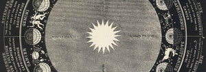
- The Theory and Practice of Color Poster
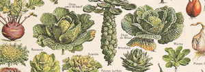
- Green Vegetables and herbs Poster
- Métamorphose du violon Poster
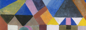
- Bauhaus Poster 11 Poster
- Bauhaus Poster 10 Poster
- Faust , tragédie de Goethe Poster
- Farbstudien, 10 Blätter IX Poster
- Farbstudien, 10 Blätter VIII Poster
- Randy Brecker Quintet Poster
- Nothing like a good book Poster
- Familiar colors Poster
- The Charm of Color Poster
-
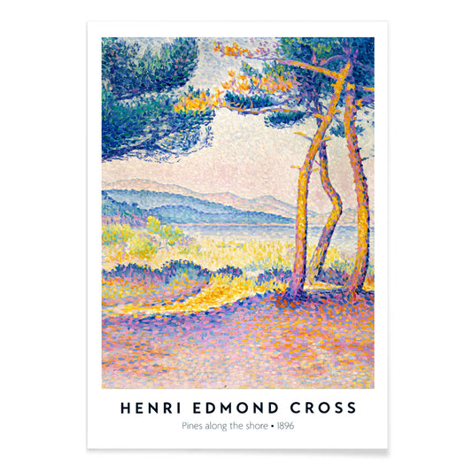
Pines Along the Shore Poster
Henri-Edmond Cross · 1896 · Luminous pointillist seaside art print with pines, cliffs, and shimmering blue water
Poster from €9 · Framed from €16
Regular price From €6,00Regular price -
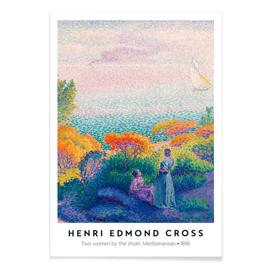
Two Women by the Shore Poster
Henri-Edmond Cross · 1896 · Radiant seaside art print showing two women with shimmering light and calm horizons
Poster from €9 · Framed from €16
Regular price From €6,00Regular price -
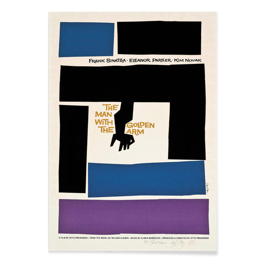
The man with the golden arm Poster
Saul Bass · 1955 · Iconic movie poster featuring a jagged white arm motif with bold modernist typography
Poster from €9 · Framed from €16
Regular price From €6,00Regular price -
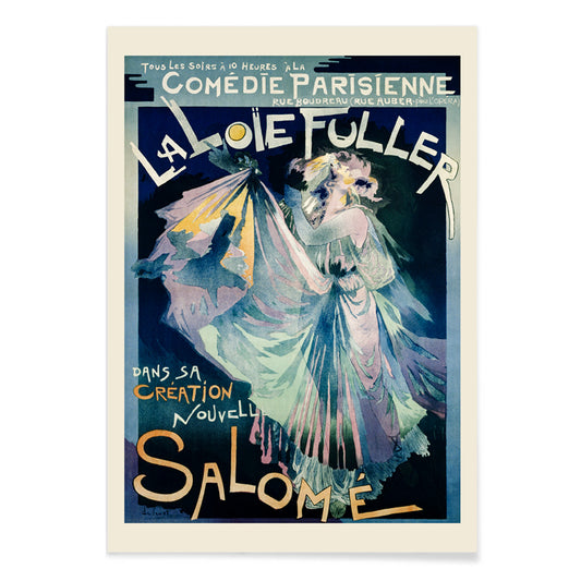
Comédie–Parisienne Poster
Georges de Feure · 1895 · Art Nouveau Loie Fuller poster with swirling stage drapery and luminous blue tones
Poster from €9 · Framed from €16
Regular price From €6,00Regular price -
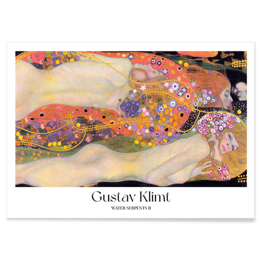
Water Serpents II Poster
Gustav Klimt · 1907 · Sensual Art Nouveau art print of water nymphs entwined in gold, violet, and coral
Poster from €9 · Framed from €16
Regular price From €6,00Regular price -
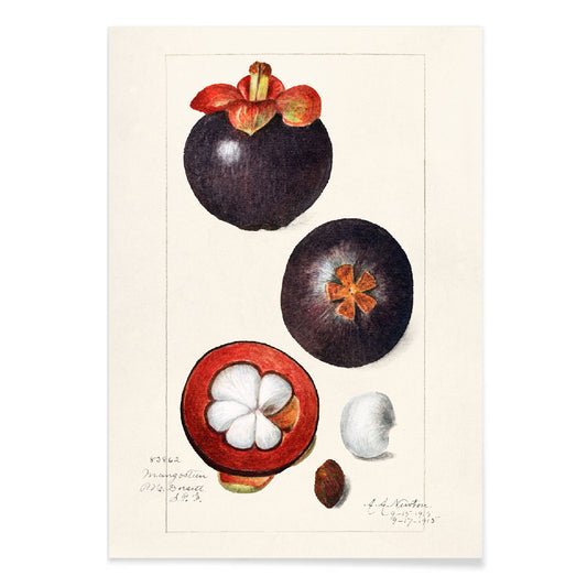
Garcinia Mangostana Poster
Amanda Almira Newton · 1915 · Delicate mangosteen print featuring glossy green leaves and a split fruit with white pulp
Poster from €9 · Framed from €16
Regular price From €6,00Regular price -
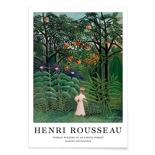
Woman Walking in an Exotic Forest Poster
Henri Julien Félix Rousseau · 1905 · Dreamlike jungle art print with a solitary woman amid layered tropical foliage
Poster from €9 · Framed from €16
Regular price From €6,00Regular price -
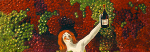
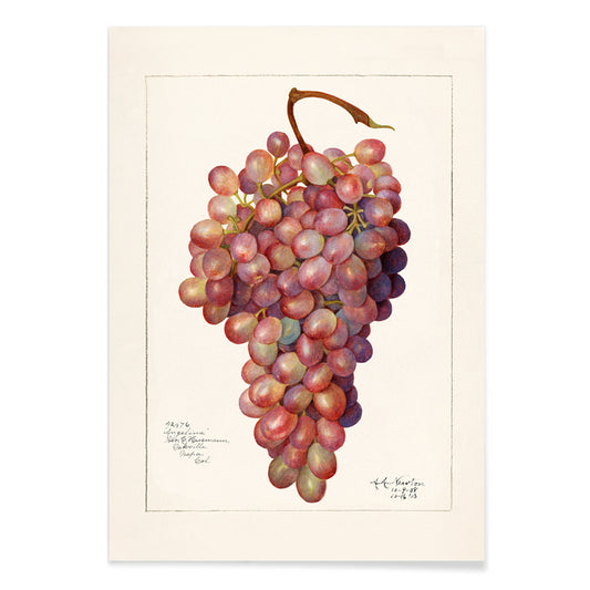
Vintage bunch of red grape Poster
Amanda Almira Newton · 1912 · Lifelike red grape botanical print with plump clustered fruit and delicate vine leaves
Poster from €9 · Framed from €16
Regular price From €6,00Regular price -
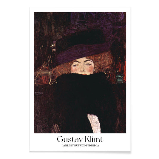
Lady with hat and feather boa Poster
Gustav Klimt · 1909 · Elegant fashion portrait art print with dramatic hat and feathery boa
Poster from €9 · Framed from €16
Regular price From €6,00Regular price -
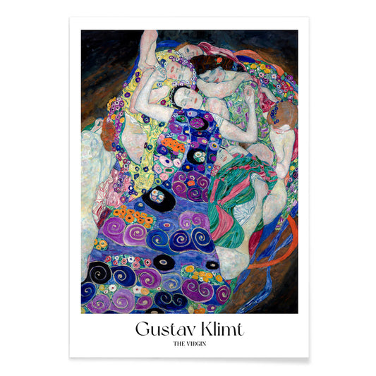
The Virgin Poster
Gustav Klimt · 1913 · Sensual Symbolist poster of intertwined women drifting in a violet spiral of patterns
Poster from €9 · Framed from €16
Regular price From €6,00Regular price -
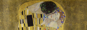
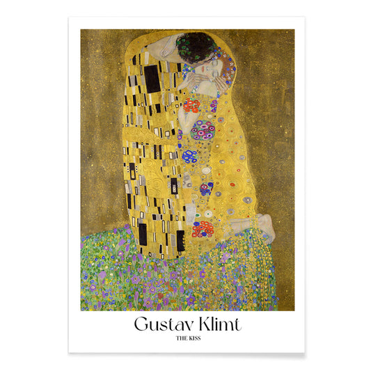
The Kiss Poster
Gustav Klimt · 1908 · Luminous gold art print of an embracing couple wrapped in patterned robes
Poster from €9 · Framed from €16
Regular price From €6,00Regular price -
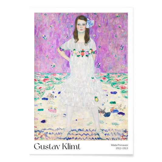
Mäda Primavesi Poster
Gustav Klimt · 1913 · Radiant portrait art print of Mäda in a patterned dress amid ornamental florals
Poster from €9 · Framed from €16
Regular price From €6,00Regular price -
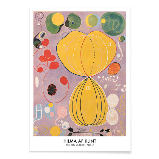
The Ten Largest No 7 Poster
Hilma af Klint · 1907 · Radiant abstract art print with swirling biomorphic forms on a sunlit yellow field
Poster from €9 · Framed from €16
Regular price From €6,00Regular price -
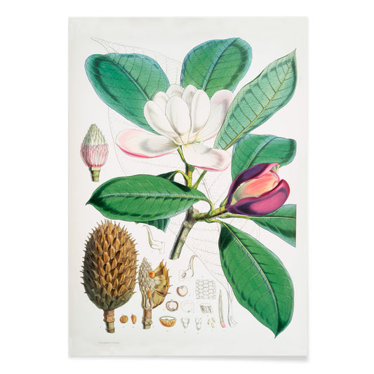
Talauma Hodgsoni Poster
Walter Hood Fitch · 1855 · Delicate magnolia botanical print with creamy bloom, glossy leaves, and precise Victorian linework
Poster from €9 · Framed from €16
Regular price From €6,00Regular price -
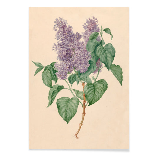
Purple Lilacs Poster
Maria Geertruida Barbiers-Snabilié · 1815 · Delicate lilac branch botanical print with soft purple clusters and fresh green leaves
Poster from €9 · Framed from €16
Regular price From €6,00Regular price -
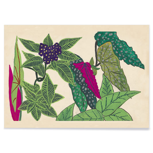
Leaves and fruits Poster
Paul Poiret · 1912 · Stylized leaves and fruit botanical print with bold green and purple forms on beige
Poster from €9 · Framed from €16
Regular price From €6,00Regular price -
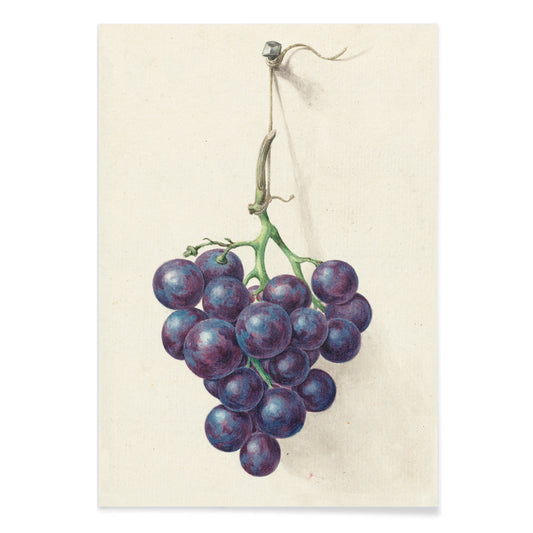
Bunch of blue grapes Poster
Jean Bernard Klée · 1810 · Realist grape cluster print with deep blue fruit and fresh green leaves
Poster from €9 · Framed from €16
Regular price From €6,00Regular price -
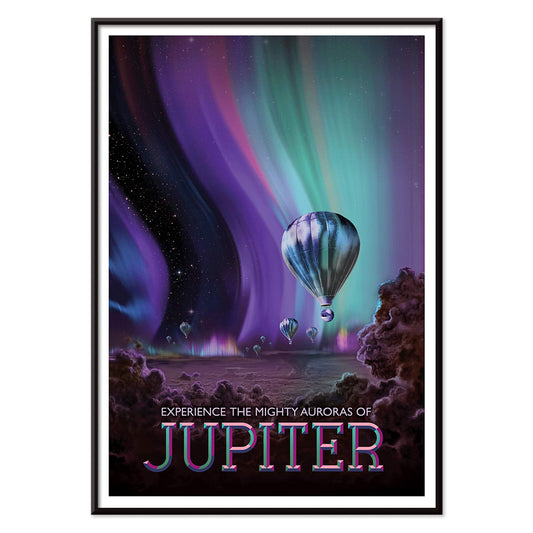
Jupiter Poster
Tyler Nordgren · 2016 · Surreal Jupiter poster with glowing polar auroras and tiny hot air balloons
Poster from €9 · Framed from €16
Regular price From €6,00Regular price -
Kepler-16b Poster
Joby Harris · 2011 · Dreamy retro space poster with twin suns setting over a calm alien horizon
Poster from €9 · Framed from €16
Regular price From €6,00Regular price -
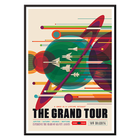
The Grand Tour Poster
Karlyn Murphy · 1977 · Vibrant retro solar system poster with sweeping trajectories and bold planetary graphics
Poster from €9 · Framed from €16
Regular price From €6,00Regular price -
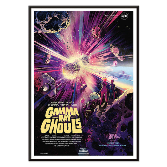
Gamma Ray Ghouls Poster
Don Davis · 2019 · Retro sci-fi space poster with astronauts drifting through a neon cosmic blast
Poster from €9 · Framed from €16
Regular price From €6,00Regular price -
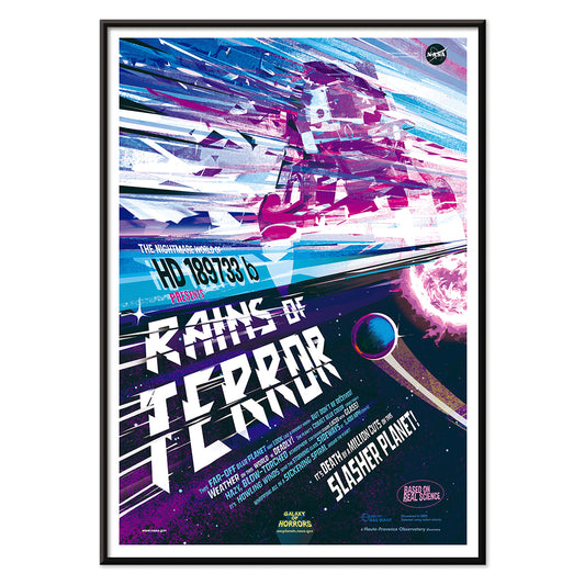
Rains of Terror Poster
Eleni Katsenidou · 1995 · Vibrant sci-fi storm poster with a looming planet and slanting meteorlike rain
Poster from €9 · Framed from €16
Regular price From €6,00Regular price -
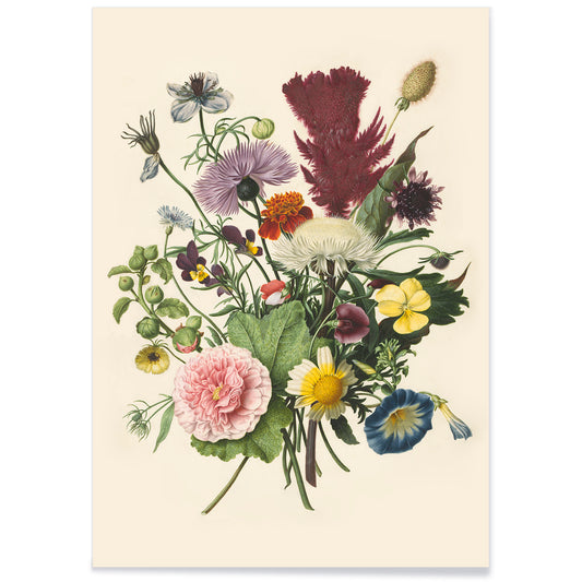
Bouquet of Flowers Poster
Herman Henstenburgh · 1700 · Lush floral art print with layered blooms, curling leaves, and jewel-like highlights
Poster from €9 · Framed from €16
Regular price From €6,00Regular price -
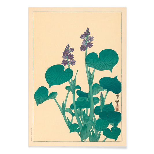
Flowering hosta Poster
Ohara Koson · 1930 · Serene Japanese botanical print of flowering hosta with broad green leaves and soft purple bells
Poster from €9 · Framed from €16
Regular price From €6,00Regular price


A Color That Thinks in Shadows
Purple behaves like dusk in interior decoration: it deepens neutrals, cools bright whites, and makes brass read warmer. In the history of the vintage poster and art print, violet also signals modern chemistry and modern taste, from late nineteenth-century inks to mid-century screen processes. This selection gathers posters and wall art where purple appears as pigment, twilight, or a single accent note, moving between floral studies, symbolist reverie, and studio-style diagrams. For nearby palettes, it pairs naturally with Black & White contrast, the open air of Landscape scenes, and the quiet structure of Minimalist compositions.
From Secession Ornament to Visionary Abstraction
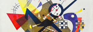
Gustav Klimt used pattern as atmosphere, and violet shadows help hold his surfaces together. In The Kiss (1907–1908) by Gustav Klimt, the gold mosaic reads like textile and icon at once, while the surrounding purples keep the embrace grounded rather than sugary. Hilma af Klint treats purple less as mood than as a register of thought: The Ten Largest, No. 6 (1907) by Hilma af Klint uses lilac and violet as structural cues, guiding the eye through spirals, seed forms, and annotated curves. This lineage connects easily to the symbolic undercurrents in Esoteric imagery and the lyrical experiments of Abstract art.
Where Purple Works at Home
Purple is most convincing when it operates as an accent rather than a single-note statement. In a bedroom, a violet-heavy poster above stone, oat, or chalk textiles reads calm without turning sweet; in a living room, it negotiates between walnut, bouclé, chrome, and smoked glass. It also flatters greenery: place a purple print near terracotta pots or dried grasses, then echo the hue with one plum cushion or a muted rug detail. If you want the color to feel botanically anchored, hang it near plates from Botanical studies; if you prefer sharper rhythm, let it sit beside strict geometry from Bauhaus.
Modernist Color Lessons You Can Live With
Some works here feel like studio notes turned into wall art, where hue is both subject and method. Robert Delaunay’s Composition (1930) by Robert Delaunay stacks circular intervals of plum, emerald, and lemon to create depth without traditional perspective. Albert Henry Munsell goes the other way: Atlas of the Munsell color system Pl.01 (1915) by Albert Henry Munsell maps color with measured clarity, useful in a studio corner, kitchen, or hallway where you want structure. For related graphic sensibilities, the wit of Advertising posters and the measured diagrams of Science prints keep purple from drifting into pure romance.
Curating Dusk, Distance, and Paper
To keep violet from feeling precious, combine it with scenes that carry weather and space. Ecchu Umidani Pass (1923) by Kawase Hasui offers indigo quiet and a single lantern glow, linking the palette to Japanese printmaking and the broader language of Oriental works. In framing, purple rewards breathing room: a pale mat clarifies lilac tones, while a walnut or black frame gives aubergine weight. Mixing one horizontal piece with a smaller vertical print keeps a gallery wall paced rather than symmetrical, letting the color appear, recede, and return like evening light.